
How can t shirt design stay readable when printed?

A strong t shirt design should look attractive on a screen, but it also needs to remain clear and readable after printing. Many designs look perfect on a computer or phone yet become difficult to read when transferred onto fabric. This usually happens because of poor font choices, weak contrast, excessive details, incorrect sizing, or unsuitable printing methods.
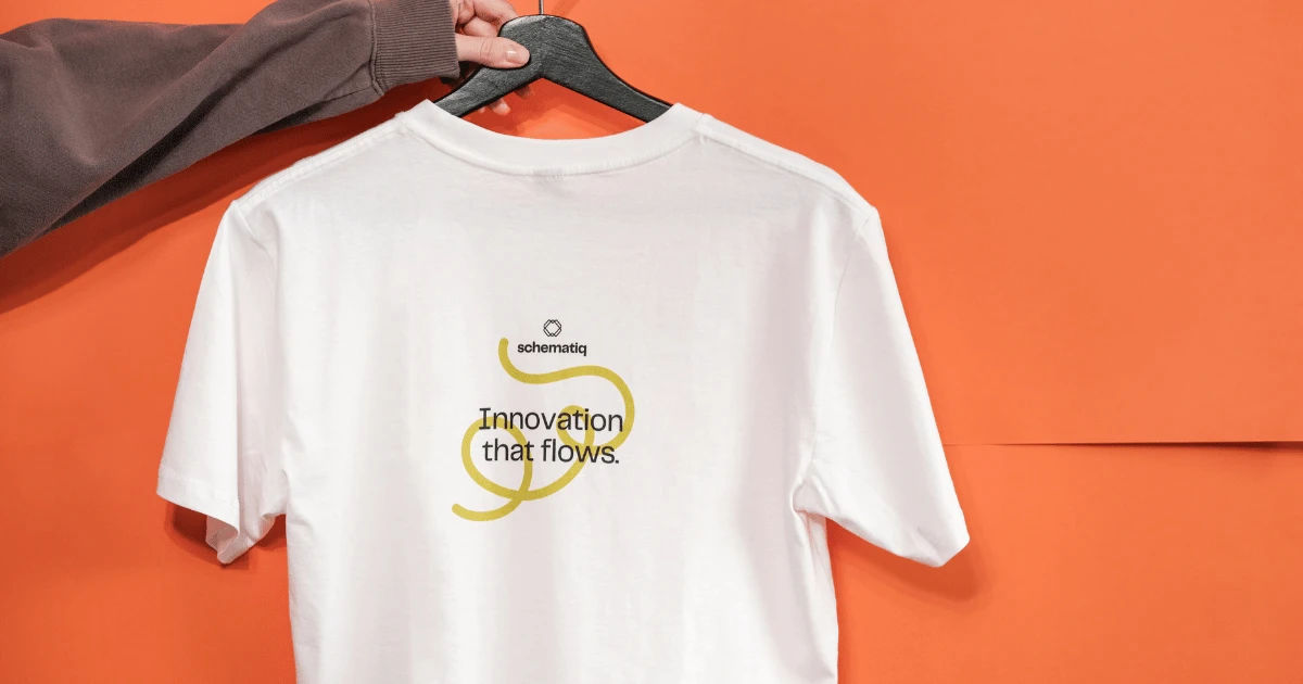
A readable shirt design communicates its message quickly. Whether the shirt features a slogan, brand name, event information, artwork, or decorative typography, viewers should be able to understand it without struggling. Good design decisions made before printing can prevent most readability problems.
This comprehensive guide explains how to create a shirt graphic that remains sharp, balanced, and easy to read on different fabrics and printing methods.
Why Readability Matters in Shirt Printing
Readability is one of the most important parts of effective apparel design. A shirt is often viewed from several feet away, so small details that appear obvious on a monitor may disappear when printed.
A successful design should communicate its main message immediately. If people have to move closer to understand the wording, the design may need improvement.
Readability is especially important for promotional shirts. Businesses often use apparel to display names, slogans, websites, phone numbers, or social media information. If these elements cannot be read easily, the shirt loses much of its marketing value.
Readability also matters for personal shirts. A funny quote, team name, graduation message, or event slogan should be recognizable at a glance.
Choose Fonts Carefully
Typography has a major effect on printed readability. A beautiful font is not necessarily a practical font for clothing.
Decorative fonts can contain thin strokes, unusual shapes, and tight spacing. These characteristics may look interesting digitally but become unclear when printed on fabric.
Use Simple Fonts for Important Text
Sans-serif fonts are often effective because they have clean shapes and uncomplicated letterforms. Fonts with medium or bold weights are usually easier to recognize from a distance.
For example, a bold typeface can make a short slogan stand out clearly. A lightweight script font may be better reserved for a small decorative element rather than the primary message.
The most important words should receive the strongest visual treatment.
Avoid Extremely Thin Lettering
Thin lines can disappear during printing, particularly on textured fabrics. Even if the printer produces accurate results, fabric fibers can make delicate strokes look broken or faded.
When creating a design, examine the thinnest parts of every letter. If a stroke looks barely visible on screen, it may become even less noticeable after printing.
Give Letters Enough Space
Crowded typography can make even a large message difficult to read. Letter spacing and line spacing should provide enough room for each character to remain distinct.
Avoid squeezing long phrases into a small area simply to make everything fit.
Use Strong Color Contrast
Contrast is essential for readable apparel graphics. Text needs to stand apart from the fabric and surrounding artwork.
A dark design printed on a dark shirt may become difficult to see. Similarly, light yellow lettering on a white shirt can lose much of its visibility.
Think About the Shirt Color
Always evaluate the artwork against the actual fabric color rather than viewing it only against a white digital background.
A design intended for a black shirt may require different colors than the same design printed on a white shirt.
For example, white, cream, or bright lettering can work effectively on a dark garment. Darker lettering may be more appropriate for a light garment.
Avoid Weak Color Combinations
Some colors have enough difference in hue to appear attractive but not enough contrast to remain readable.
Red text against a dark purple background, for example, may appear muddy. Medium-gray lettering against a similarly colored shirt can also become difficult to distinguish.
When selecting colors, consider brightness as well as hue.
Select the Right Text Size
Text size should match the viewing distance and purpose of the shirt.
A large slogan across the chest can use much larger lettering than a small logo placed near the pocket.
If the shirt contains important information, make that information large enough to be recognized from a reasonable distance.
Consider the Printing Area
The printable area of a shirt has practical limits. Designers sometimes try to include too much information in a restricted space.
Instead of reducing the font until everything fits, remove unnecessary content.
A shorter message printed clearly is generally more effective than a long message printed in tiny lettering.
Keep the Design Simple
One of the easiest ways to protect readability is to avoid unnecessary visual complexity.
A crowded graphic can compete with its own text. Multiple illustrations, patterns, shadows, textures, and decorative elements may cause the main message to disappear.
A strong design usually has a clear visual hierarchy.
The viewer should immediately recognize the primary element, followed by supporting information.
Establish a Clear Hierarchy
Think about the design in levels.
The main message should be the most noticeable part. Supporting words can be smaller. Decorative elements should generally remain secondary.
For example, a shirt for a school event might place the event name prominently in the center, the date underneath it, and a small illustration around the text.
This structure helps viewers understand the information naturally.
Pay Attention to Placement
Even perfectly designed text can become difficult to read if it is placed incorrectly.
The position of the graphic should work with the shape of the garment and the movement of the person wearing it.
Avoid Problematic Areas
Text placed too close to seams, pockets, collars, or edges can become distorted or partially hidden.
A centered chest design usually provides a predictable reading area.
For smaller graphics, make sure the design does not overlap areas that naturally bend or fold.
Consider How Fabric Moves
Clothing is not a flat sheet of paper. Fabric folds, stretches, and moves.
A design that looks perfectly aligned on a flat mockup may appear different when the shirt is worn.
This is another reason to avoid extremely small text and overly complicated lettering.
Use Vector Artwork When Possible
File quality can directly affect readability.
Vector graphics are particularly useful for logos, typography, and simple illustrations because they can be resized without becoming pixelated.
Common vector formats include SVG, AI, and EPS.
Raster images can also produce excellent results when they have sufficient resolution. However, enlarging a low-resolution image can cause blurry edges and jagged lettering.
Check Resolution Before Printing
If the artwork contains raster elements, inspect the resolution at the actual intended print size.
A graphic that looks sharp when displayed as a small image on a screen may not remain sharp when enlarged to cover the front of a shirt.
High-resolution artwork gives the printer more information to work with and helps preserve clean edges.
Add Outlines When Appropriate
An outline can improve the visibility of text when the lettering needs additional separation from the background.
For example, light-colored text placed over a busy illustration may benefit from a dark outline.
However, outlines should be used carefully.
An excessively thick outline can make letters appear crowded and alter the original typography. The goal is to separate the text from the background without overwhelming it.
Avoid Placing Text Over Busy Artwork
Text printed over detailed illustrations can be difficult to understand.
Faces, patterns, photographs, and textured backgrounds may compete with lettering. Even strong contrast can sometimes become ineffective when the background contains too many visual changes.
One solution is to create a clear area behind the text.
A solid shape, subtle shadow, border, or simplified background can give the words enough breathing room.
Test the Design at Actual Size
One of the most useful steps is to test the artwork at the size it will actually be printed.
Designers often examine their work while zoomed in. At 200% or 400%, small details can appear much clearer than they will on the finished garment.
Print a physical proof whenever possible.
Even a basic paper print can reveal whether the lettering feels too small, crowded, or thin.
Step Back From the Proof
Place the proof at approximately the distance from which people will normally view the shirt.
Then ask yourself:
Can I read the main message immediately?
Can I distinguish individual letters?
Does the background compete with the text?
Is the hierarchy obvious?
If the answer to any of these questions is no, make adjustments before production.
Consider the Printing Method
Different printing techniques can affect how sharp and durable text appears.
Screen printing, direct-to-garment printing, heat transfer, sublimation, and embroidery all have different capabilities.
A design that works perfectly with one method may require adjustments for another.
Screen Printing
Screen printing is popular for apparel because it can produce strong colors and durable results. However, extremely fine details may require specialized preparation.
Simple, bold typography is generally easier to reproduce consistently.
Direct-to-Garment Printing
Direct-to-garment printing can reproduce detailed artwork and many colors. It is often useful for designs containing photographs or complex illustrations.
However, fabric type and garment color can influence the final appearance.
Embroidery
Embroidery is not technically ink printing, but it is another common way to place graphics on shirts.
Very small letters can be difficult to embroider because stitches require physical space. Simplifying the typography is often necessary.
Use Mockups Before Production
Digital mockups provide a useful preview of how the finished garment may look.
Place the artwork on a realistic shirt image and view it from different distances.
A mockup can reveal problems with scale and placement that are difficult to notice when looking only at the isolated graphic.
However, a mockup should not replace a physical sample when accuracy is particularly important.
Consider Fabric Texture
The material of the shirt can influence perceived readability.
Smooth fabrics may provide a cleaner surface for detailed graphics. Textured fabrics can slightly disrupt fine lines and small lettering.
Dark garments may also require special printing considerations depending on the printing technology.
Before finalizing a design, consider the actual garment material, color, and finish.
Avoid Excessive Effects
Drop shadows, gradients, glows, distressed textures, and other effects can add personality to a graphic.
However, excessive effects can reduce clarity.
A common mistake is applying several effects to text simply because the software makes them easy to add.
Use effects only when they serve a purpose.
If removing an effect makes the message clearer, the simpler version is often better.
Check Spelling and Grammar
Readability is not only visual.
A typo can undermine an otherwise professional shirt.
Before sending artwork to a printer, carefully check every word, number, date, URL, and name.
Ask another person to proofread the design as well. A fresh set of eyes can identify mistakes that the designer has overlooked.
Design for the Target Audience
A readable shirt should also match the expectations of the people who will wear or see it.
A children's event may use playful typography, while a professional business shirt may require a cleaner and more restrained appearance.
Think about where the shirt will be worn.
A sports team shirt needs strong visibility from a distance. A fashion-oriented design may prioritize artistic typography but should still maintain enough clarity to communicate its intended message.
Common Mistakes That Reduce Readability
Several design mistakes appear repeatedly in printed apparel.
Using Tiny Text
Small text may look elegant on a computer but become nearly impossible to read on fabric.
Using Low Contrast
Similar colors can blend together and make important information disappear.
Choosing Overly Decorative Fonts
Complex lettering can reduce recognition, especially at smaller sizes.
Adding Too Many Elements
Crowded graphics create visual competition and weaken the hierarchy.
Ignoring the Fabric
A design should always be evaluated against the actual garment color and material.
Skipping a Test Print
A final proof can expose problems before hundreds of shirts are produced.
A Practical Pre-Printing Checklist
Before approving a t shirt design, review the following points:
- Is the main message immediately readable?
- Is the font thick enough for the chosen printing method?
- Is there enough contrast between text and fabric?
- Is the text large enough for its intended viewing distance?
- Does every letter have sufficient spacing?
- Is the artwork high resolution?
- Are important elements away from seams and folds?
- Does the background interfere with the text?
- Has the design been tested at actual print size?
- Has spelling and grammar been checked?
- Has the design been reviewed against the real shirt color?
- Has a physical sample been considered?
This checklist can prevent many expensive production mistakes.
Conclusion
Creating a readable t shirt design requires more than selecting an attractive graphic and placing it on a garment. Typography, contrast, sizing, spacing, placement, fabric, artwork quality, and printing technology all influence how clearly the final product communicates.
The most effective approach is to design with the finished shirt in mind from the beginning. Choose fonts that remain recognizable, use strong contrast, keep important information appropriately large, and avoid unnecessary visual clutter.
Always remember that clothing behaves differently from a digital screen. Fabric folds, stretches, absorbs ink, and changes how colors and details appear. Testing the artwork at its intended size can reveal problems before they reach production.
A successful design does not need to be complicated. In many cases, a simple layout with strong typography and clear contrast will communicate more effectively than a crowded graphic filled with effects.
By following these principles, designers can create shirts that are attractive while ensuring that slogans, names, logos, and other important information remain easy to recognize. Good readability ultimately makes the garment more useful, professional, and visually effective.